DentistCare
DentistCare is an insurance company that provides malpractice insurance for dentists.

DentistCare - Adding New Functionality
Project Background
DentistCare is a professional liability insurance program for dentists, oral surgeons, and other dental specialists. They’ve been in business since 1976. Their business mainly comes from relationships with agents. However, the market is changing, and many dentists are moving away from working with agents. They are younger and want more control over their careers.
Problem
DentistCare does not have a way for dentists to obtain coverage online without the help of an agent. They are looking to update the current website to create an effortless experience for new dentists to get coverage without overhauling the entire website.
My Role
UX/UI Designer
Tools
Figma
Research
My first step was to review the current website for DentistCare. Here’s what I found from my research:
No dedicated student page
No way to get a quote without the help of an agent
No way to apply for coverage without the help of an agent
Coverage explanations were available
Easy to find continuing education information
No contact information is easily available without scrolling all the way to the bottom

My next step was to do a competitive analysis to see if other companies were providing a way for dentists to apply for coverage without going through an agent. I reviewed DentistCare’s top three competitors, MedPro, PPP, and Dentist Advantage. From my research I was able to gather the following:
Each site had a student dedicated page
A student was able to receive a quote
MedPro and PPP had the ability to apply for coverage from their websites


Design
From my research I felt DentistCare should focus on the following:
Providing a way for students to apply for coverage
Creating a Students’ section that would help explain products and services available to new dentists only
Below are the initial sketches I created.
For the home page, I suggested that a Students link be added to the top navigation so it would be easy for students and residents to find information on the products and services available.
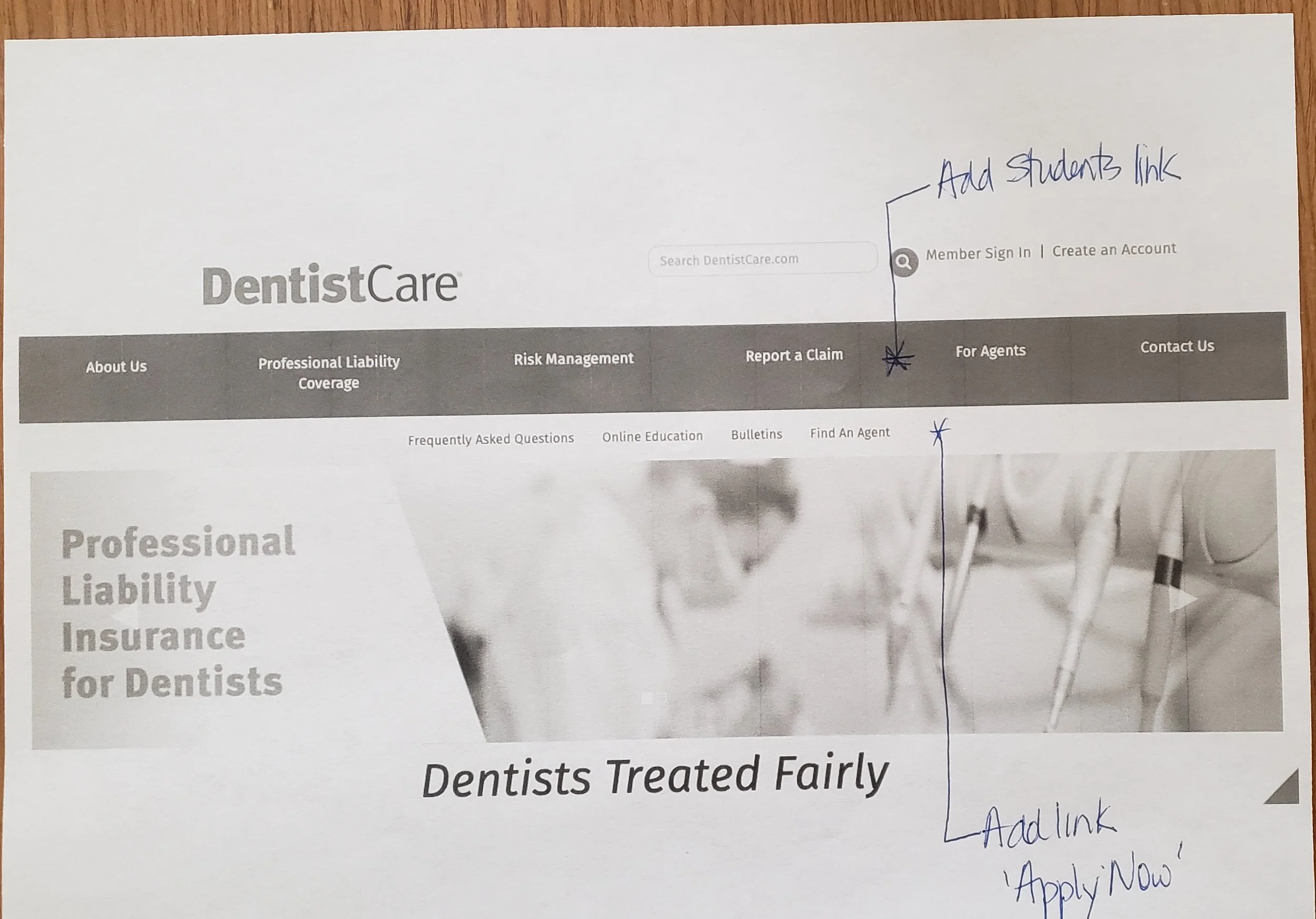
The Student Page is new. I kept the same format as the other pages and added the Apply Now link to the left navigation. Placeholder links were added for additional information that could be added in the future.

Validation
When I initially made changes to the sketches I added the “Apply Now” link to the left navigation on the Students page. Once I started creating the changes in Figma I noticed there was no way for someone to see this link unless they went to the Students page. Therefore, I decided to add the Apply Now link to the secondary menu so it would be available throughout the site.
To validate these changes I would have created a few test cases.
I would have met with the underwriters because they speak to dentists daily on the phone and guide them on where to go on our site to find information. I would have given them a test to see if they would be able to find the link and determine how long it took for them to find it. Then I would’ve asked if it made sense where it was located.
Before shipping the changes to production, I would get with the product owners to determine what metrics to use to determine success.
Iteration
Desktop Designs
On the home page, the Students link was added to the top navigation, and the Apply Now link was added to the secondary navigation.

On the Students Page the Apply Now link was added to the left navigation and continues to appear on the secondary top menu as well. Additional links can be added if needed to the left navigation.

Mobile Designs
When I began creating the screens for the mobile versions I realized the menus used for the desktop version would not work for mobile due to screen size limitations. I decided to do some research to see how other sites settle this issue. I learned that most companies use a hamburger menu so I decided to go that route.
Based on the trend I placed the hamburger on the upper left corner of the screen. For consistency, the menu will remain in this place throughout the site.

Above is the hamburger menu that will appear once a user clicks on the three lines in the upper left corner.
The Apply Now button was moved from the secondary menu to the main menu so a user could get to this information with as minimal clicks as possible. I also moved it to the top of the menu so it would be one of the first items a user would see.

Above is the Students Page. The path was added to the top so the user would know where they were within the site.
The Apply Now link was added to the page for those students who are already on the page reviewing products and services.
The Apply Now link was added further down the page because students are usually researching the company when they view this page. Once they research and see what educational options DentistCare is offering they will decide if they want to apply or not.

Reflections
This was the first UX design project I attempted to do and I learned a lot from it. As a beginner, I wanted to jump right in and begin designing without researching anything, and of course, that created a lot of issues on the front end. I didn’t think about some of the aspects of a student’s journey to find coverage until I reviewed the personas that were provided by the company. This made me go back to my designs and make updates that I thought would make their lives easier.
If I had more time to dedicate to this project I would help build the Students page more. I would dive deeper into the kinds of information they would want to see and possibly add links to articles that may be of interest to them. I would also recreate the application to include only the information needed to obtain coverage.
All in all, I learned a lot about condensing research done by others and not to start designing anything until you’ve had a chance to look at the big picture and figure out what you’re doing and why.